
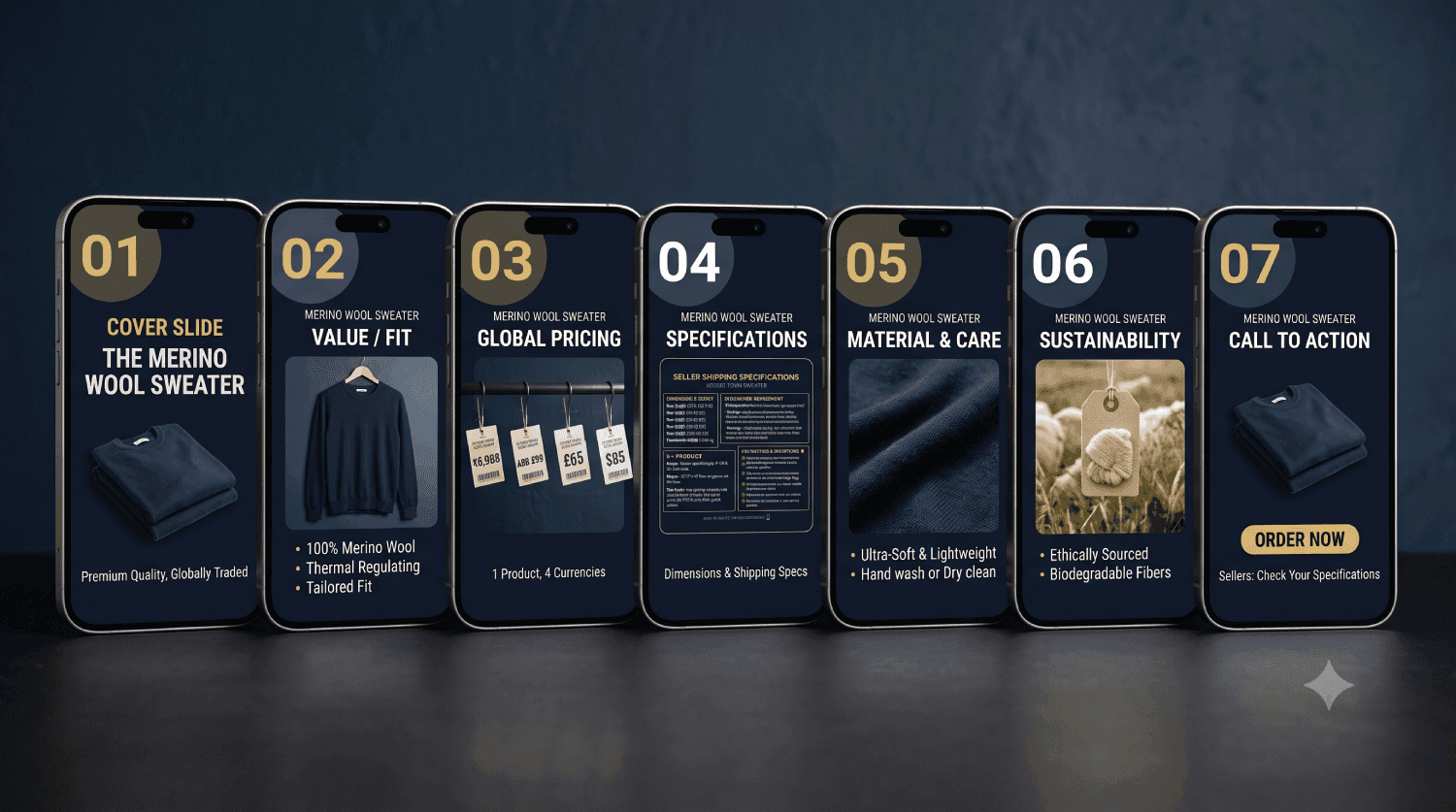
Amazon Listing Images: The 7-Image Structure That Sells
Most sellers treat Amazon images as a photography job. Shoot the product on white, fill the remaining slots with whatever the shoot produced, move on.
That's the expensive mistake. On Amazon, your images aren't photographs — they're the entire sales conversation. The buyer will not read your bullet points. Eye-tracking study after eye-tracking study says the same thing, and anyone who has watched a customer shop on a phone already knows it: they swipe the carousel, they glance at the price, they buy or they leave.
You get roughly seven frames to answer every objection a salesperson would handle in a shop. The order matters as much as the content.
Here's the structure we use on supplement and FMCG listings, slide by slide, with the brief we hand photographers.
Before the slides: what you're actually fighting
Three constraints shape every decision below.
The thumbnail is tiny. In search results on a phone, your main image is roughly the size of a postage stamp. If the product isn't recognisable at that size, nothing else in this article matters. Shrink your main image to 150px and look at it. Most sellers have never done this and it shows.
Nobody zooms. Zoom exists, and a small minority use it. Design as though it doesn't. Anything that only reads at 100% is decoration.
The carousel is a funnel with an exit at every frame. Each swipe loses people. That's why the sequence runs strongest objection first, not prettiest shot first.
The specs, current as of this writing
Amazon's requirements shift and vary by category, so treat this as a starting point and confirm in Seller Central for your own category before a shoot. Getting this wrong means suppression, and a suppressed listing earns nothing while you wait on Seller Support.
- Main image background — pure white, RGB 255, 255, 255
- Frame fill — product occupies about 85% of the frame
- Minimum longest side — 1,600px, which is what activates zoom
- Recommended size — 2,000 × 2,000px, square
- File format — JPEG preferred; PNG and TIFF accepted
- Colour profile — sRGB
- Main image prohibitions — no text, logos, watermarks, badges, borders, props, or additional products
- Supporting images — text, graphics, lifestyle and props are all permitted
- Slots available — typically 6 images plus video, or 7 images if you don't upload one
That last point is the one that catches people. Upload a video and it takes a carousel position. Decide deliberately which you'd rather have — on most supplement listings we'd keep the video and drop the weakest graphic slide.
The framework at a glance
- Hero — be recognised in a grid of forty competitors
- The one reason to buy — land your strongest claim before they swipe
- What's inside — prove the product is the real thing
- How to use it — remove "I won't know what to do with this"
- Scale and context — stop the "smaller than I thought" return
- Why you, not them — close the comparison they're already making
- Reassurance — handle the last hesitation
Now the detail on each, and the brief we hand photographers.
Slide 1 — The hero
Job: be recognised in a grid of forty competitors.
Pure white, product straight on, filling the frame. No shadows that read as grey at thumbnail size. No angled "dynamic" compositions that make the pack harder to identify.
The temptation is to make this slide beautiful. Resist it. This slide has one job and beauty is not it. A customer scanning search results is matching a shape and a colour against the thing they half-remember from an ad. Make the shape obvious.
Two things we test on every listing:
- The 150px test. Shrink it. Can you tell what the product is and read the brand name? If not, the pack design is too busy for marketplace or the crop is too loose.
- The grid test. Screenshot the actual search results page for your main keyword, drop your image in, and look at it beside the real competition. Half the time the answer is that your pack is the same colour as the category leader's, and that is a branding problem no photographer can fix.
For supplements specifically: the front label must be legible, the quantity and serving count must be visible, and the flavour or variant should be distinguishable from your other SKUs. Buyers returning for a repeat order are pattern-matching on a half-second glance.
Slide 2 — The one reason to buy
Job: land your single strongest claim before they swipe away.
This is the highest-value frame in the carousel and most sellers waste it on a second product angle.
One claim. Large type. Supported by the image, not floating over it. If your protein is 27g per serving and the category average is 22, that number owns this frame. If your ghee is bilona-made in small batches, show the process and say it in six words.
The discipline is picking one. Everything else in the carousel is secondary — this is the frame that decides whether they keep swiping or go back to search.
Type rules that keep this legible on a phone:
- Headline no smaller than 90px on a 2,000px canvas
- Maximum eight words
- Dark text on light ground, or light on a solid dark panel — never text sitting directly on a photograph without a panel behind it
- One font, two weights, and leave the drop shadows alone
Slide 3 — What's inside, and how much
Job: answer "is this the real thing and is it enough".
For supplements and food, this is where trust is won or lost. Show the supplement facts panel or ingredient list rendered legibly — not a photograph of the back of the pack at an angle, an actual readable rendering.
Call out what matters and what's absent. "No added sugar", "No palm oil", "Third-party tested" are objections, not features. Each one you answer here is a customer who doesn't leave to check a competitor.
Include serving count and cost per serving if the maths flatters you. A ₹1,499 tub that works out to ₹25 a serving beats a ₹899 tub at ₹38, but only if you do the arithmetic for them. Nobody divides on a phone.
For the Indian market, FSSAI licence number and veg/non-veg marking belong here. For Saudi, SFDA registration. These are not decoration — for a cautious buyer they are the whole decision.
Slide 4 — How to use it
Job: remove the friction of "I won't know what to do with this".
Three or four steps, numbered, with real imagery rather than icons where you can manage it. One scoop, 200ml water, shake, drink. Twice daily after meals.
This slide does more for repeat purchase than anything else in the carousel, and it quietly reduces returns. A customer who uses the product correctly in the first week is a customer who reorders. One who guesses and gets it wrong blames the product.
For FMCG and food, this is where recipes or serving suggestions earn their place. For skincare, where in the routine it sits and what it layers with.
Slide 5 — Scale and context
Job: stop the "it's smaller than I thought" return.
Size confusion is one of the most common and most avoidable causes of returns, and returns on marketplace are expensive twice — the refund and the account health hit.
Show the product held in a hand, or beside a universally understood object. Add actual dimensions in both cm and inches. If it's a 1kg pack, show what 1kg looks like next to a coffee mug.
This is also the right frame for a lifestyle shot — the product in the setting where it'll be used, with a person if your category allows. Lifestyle imagery raises perceived value, but put it here rather than at slide 2, where it would cost you the claim.
Slide 6 — Why you and not them
Job: close the comparison the buyer is already making in another tab.
A comparison table works well, with the honest caveat that you cannot name competitors. "Us vs typical" is the convention and everyone understands the code.
Pick four or five rows where you genuinely win. Do not invent rows. Buyers are better at spotting a rigged table than sellers assume, and a table that claims superiority on everything reads as a table that claims nothing.
If you have multiple SKUs, this frame can instead be a range shot — the whole family together, with a line about which is for whom. That converts browsers into the right SKU rather than the cheapest one.
Slide 7 — The reassurance
Job: handle the last hesitation.
Certifications, guarantee, manufacturing, origin. GMP, ISO, lab-tested, made in India, 30-day guarantee if you offer one.
Keep it visual — badge-style, with a short line of context under each. A wall of logos means nothing; a badge with "Tested by an NABL-accredited lab, batch by batch" means something.
If you have a founder story that's genuinely short, this is where it lives. Two sentences and a face. Longer than that belongs in A+ content, not the carousel.
A worked example: a 1kg whey protein listing
Abstract frameworks are easy to nod along to and hard to apply. So here's the same seven slides filled in for a product almost everyone can picture — a 1kg whey protein isolate, chocolate, sold at ₹3,299 in a category where the shelf is brutal.
Slide 1. Tub straight on, pure white, label flat to camera. Flavour name legible at thumbnail. Nothing else. The brand's tubs are matte black, which is a problem — half the category is matte black — so the flavour band gets pushed larger than the pack design intends. That's a deliberate trade: on-shelf consistency loses to marketplace legibility.
Slide 2. "27g protein. 0g added sugar." Two numbers, nothing else, on a dark panel beside the tub. Not "premium quality whey isolate for your fitness journey" — that sentence means nothing and costs the most valuable frame in the carousel.
Slide 3. The nutrition panel rendered clean and readable, with four callouts: protein per serving, added sugar, servings per tub, cost per serving at ₹110. FSSAI number bottom left. A buyer comparing against a ₹2,799 competitor needs the per-serving maths done for them, because the cheaper tub is 750g and almost nobody notices.
Slide 4. One scoop, 250ml water or milk, shake, 30 seconds. Four numbered panels, real photography of the scoop and the shaker rather than icons. A line at the bottom: best within 30 minutes post-workout.
Slide 5. The tub held in a hand against a plain wall, with 1kg and the dimensions in cm beside it. This single slide reliably reduces the "smaller than expected" reviews that drag a rating from 4.4 to 4.1 — and on marketplace, that two-tenths is traffic.
Slide 6. Us vs typical, five rows: protein per serving, added sugar, servings, third-party tested, scoop included. Five rows where this product genuinely wins. There were two more where it didn't, and leaving them out is the right call; inventing a win on them would not have been.
Slide 7. Four badges — FSSAI, GMP facility, lab-tested per batch, made in India — each with one line of context underneath. Then a 30-day guarantee line if the brand offers one.
Seven slides, every common objection answered, and the buyer never had to read a bullet point. That's the whole job.
What changes on Amazon.ae and Amazon.sa
If you're selling into the UAE or Saudi Arabia, the structure holds but several things change in ways that cost you if ignored.
Arabic text is not optional on graphic slides. A meaningful share of buyers in both markets shop in Arabic. Bilingual slides — Arabic above English, or Arabic right-aligned — outperform English-only consistently enough that we treat it as default. Have a native speaker check it; machine-translated marketing copy reads as badly in Arabic as it does in Hindi.
Layout mirrors. Arabic reads right to left, so a left-to-right numbered sequence on a how-to-use slide reads backwards. Flip the direction, not just the text.
Compliance differs. SFDA registration for supplements and food in Saudi, ESMA requirements in the UAE. Expiry and production dates often need to be visible. Health claims permitted in India may not be permitted in the GCC, and a claim that triggers a takedown costs you the listing, not just the slide.
Imagery conventions. Model and lifestyle photography needs cultural sensitivity around dress and context. What reads as aspirational in Mumbai can read as inappropriate in Riyadh. This is worth a local review before you shoot, not after.
Ramadan shifts everything. Demand patterns, gifting formats, bundle sizes. Brands that prepare Ramadan-specific creative weeks ahead do markedly better than those who swap images on day two.
A+ content is not a substitute
A+ content sits below the fold on the product page. Images sit above it, next to the buy box.
Most buyers purchase without ever scrolling to A+. So the carousel carries the objections, and A+ carries depth — brand story, extended comparisons, cross-sells to your other SKUs, and the long-tail detail a considered buyer wants.
Build the carousel first. Build A+ second, and treat it as the place to sell your other products to someone already convinced about this one.
How to actually test this
Design opinions are cheap. Here's the loop.
- Baseline. Record your current conversion rate and sessions in Business Reports for the parent ASIN. Two weeks minimum, and avoid periods distorted by a sale.
- Change one thing. If you replace all seven slides at once and conversion moves, you've learned nothing about why. Start with slide 2 — it's the highest-leverage frame and the cheapest to iterate.
- Run it properly. If you're brand-registered, Manage Your Experiments runs a genuine A/B split. If you're not, swap the image and compare like-for-like periods, accepting that the data is noisier.
- Give it volume, not time. A listing doing six orders a day needs weeks to say anything meaningful. Don't call a winner at forty sessions.
- Keep the losers. A file of what didn't work is worth more after a year than any framework, including this one.
What we watch, in order: unit session percentage first, then add-to-cart rate, then return rate. A slide that lifts conversion and lifts returns has not helped you.
The mistakes we see most
- A hero that's too clever. Angled, shadowed, cropped tight. Looks great on a desktop mockup, unreadable at 150px.
- Text at 40px on a 2,000px canvas. Readable on the laptop it was designed on, invisible on a phone. Always review on a phone before uploading.
- Seven slides saying the same thing. Four angles of the same pack is one slide of information in seven slots.
- Claims that invite a takedown. "Cures", "treats", "prevents" on a supplement will get the listing pulled. The cost of that is not the slide, it's the fortnight of lost sales while you appeal.
- Ignoring the mobile crop. The app crops differently from desktop. Keep critical content away from the edges and check on the real app, not a simulator.
- Letting the pack design decide the carousel. If your packaging doesn't work at thumbnail size, fix the packaging. We've rebuilt pack artwork for brands specifically because marketplace exposed what shelf never did.
The photographer's brief
Hand this over before the shoot and you'll get a usable set in one session rather than three.
- Hero. Pure white, straight on, even light, no shadow. Deliver 3,000px square, RGB, layered file retained.
- Pack detail. Macro on the label, texture and seal. Three angles, same lighting.
- Ingredient or texture. Product out of the pack — powder, capsule, cream. Two shots, top-down and three-quarter.
- In-hand. Model hand, neutral sleeve, plain ground. Two shots, left and right hand.
- Lifestyle. Real setting, product in context, props minimal. Four shots, at least one with headroom for text.
- Range. All SKUs together with consistent spacing. One shot, flat front.
Always ask for layered files and the raws. You will re-cut these images for ads, for the website, and for the GCC listing, and re-shooting because nobody kept the PSDs is a budget line that should never exist.
Frequently asked questions
What size should Amazon product images be in 2026? 2,000 × 2,000px square is the practical standard. The minimum for zoom to activate is 1,600px on the longest side, and anything below that looks dated beside competitors. Shoot at 3,000px and downscale so you have headroom for ads and A+ content.
Can I put text on my Amazon main image? No. The main image must be the product on pure white with no text, logos, watermarks, badges or borders. Text is allowed and encouraged on every other slide. Violating this risks suppression, which takes the listing out of search entirely.
How many images can I upload to an Amazon listing? Typically six plus a video, or seven images if you don't upload one. Some categories allow more. Check your category in Seller Central — and use every slot, because an empty slot is a question you've left unanswered.
Do Amazon listing images really affect conversion that much? They're the primary driver on mobile, where most marketplace traffic now sits. Buyers swipe the carousel and skip the bullets. In our experience rebuilding listings for supplement and FMCG brands, image work moves conversion more reliably than title or bullet changes — though the size of the lift depends entirely on how weak the starting point was.
Should I use a video in my listing? Yes, if it earns its slot. A video showing the product in use, under 30 seconds, with the first three seconds carrying the point. A product spinning on a turntable is not worth a carousel position.
What's the difference between listing images and A+ content? Listing images sit beside the buy box and most buyers never scroll past them. A+ content sits below the fold and serves the considered buyer. Images handle objections; A+ handles depth and cross-selling.
Do I need different images for Amazon.ae and Amazon.sa? Yes. Bilingual Arabic and English graphic slides, mirrored layouts for right-to-left reading, and claims checked against SFDA and ESMA rules. Re-using Indian creative directly is the most common mistake we see in GCC expansion.
How often should I update listing images? When the data tells you to, not on a schedule. Review quarterly, and always refresh before a major sale event or seasonal peak. One slide at a time, measured properly.
Where to start
If you have one afternoon and an existing listing, do this: shrink your main image to 150px and look at it honestly, then replace slide 2 with your single strongest claim in large type. Those two changes move more than the other five slides combined, and you'll know within a fortnight whether they worked.
We design marketplace creative and packaging for supplement and FMCG brands in India and the GCC — carousel, A+ content and pack artwork as one system. Send us a listing and we'll tell you what we'd change first, no charge.